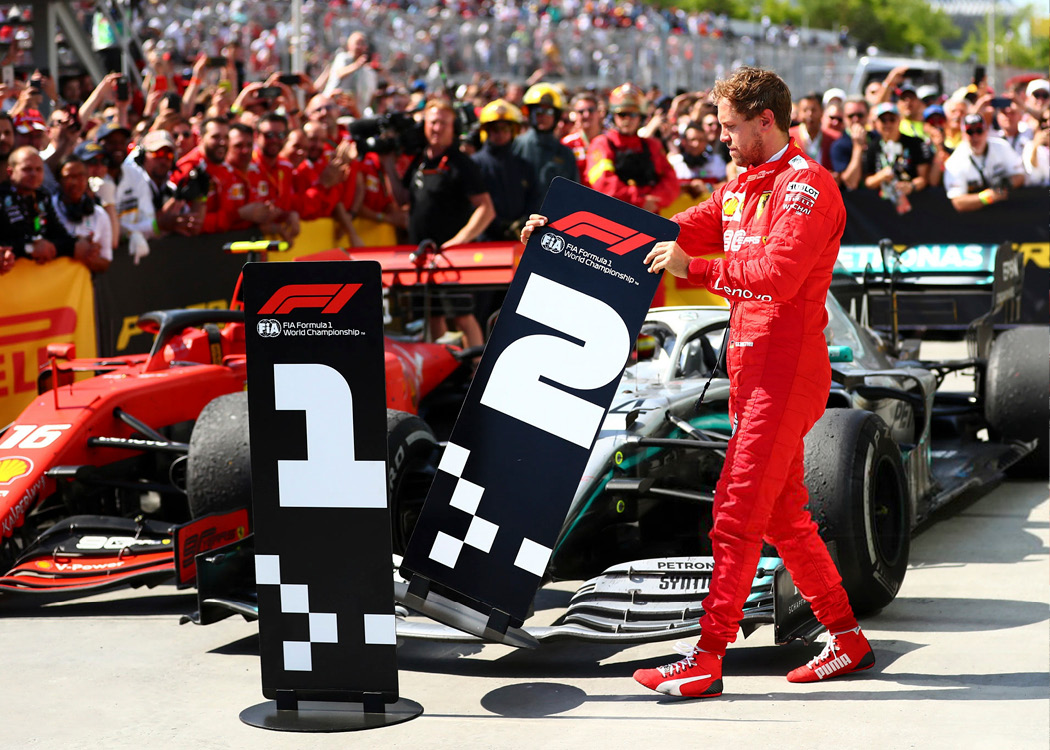
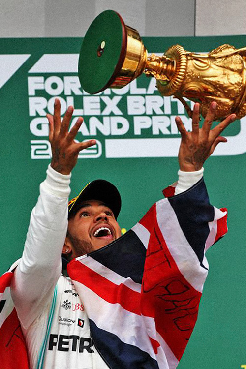
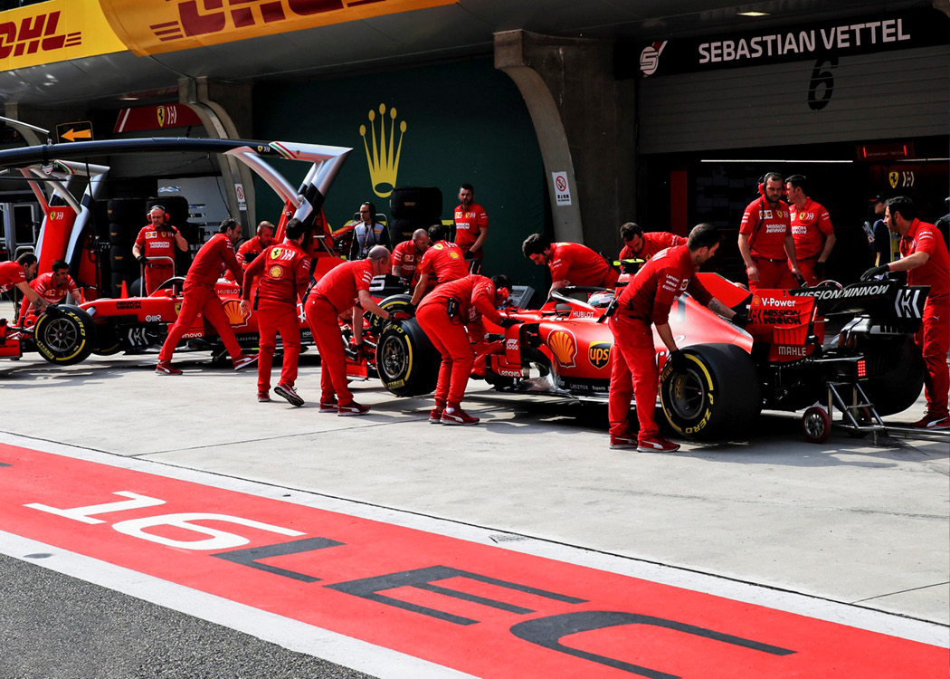
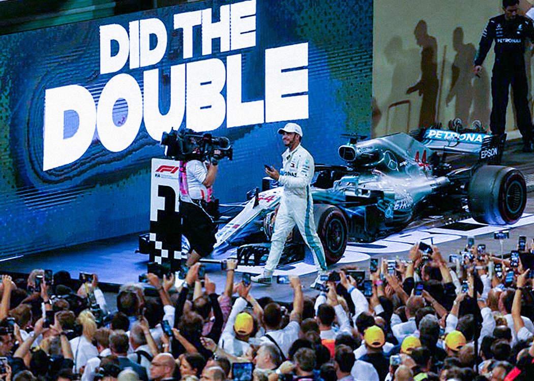
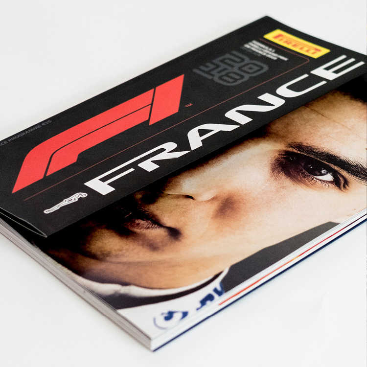
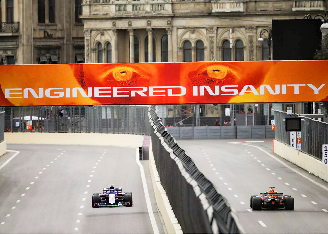
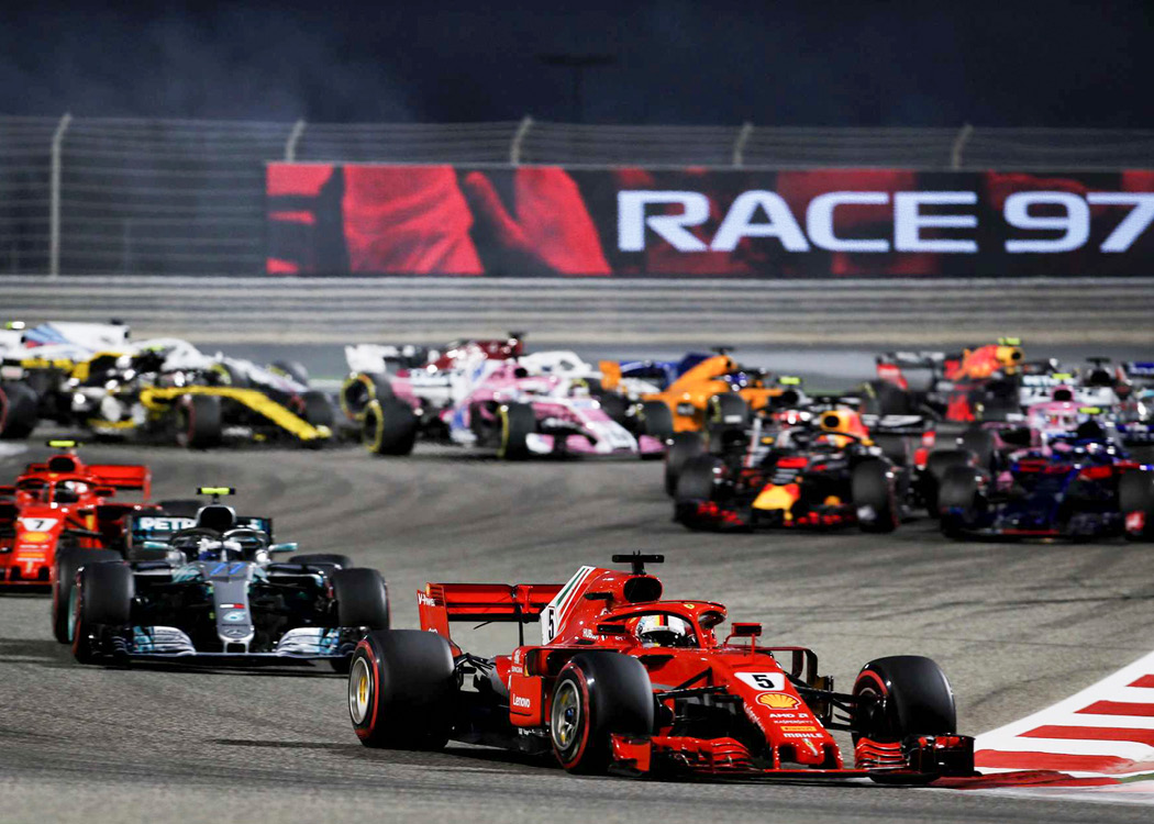
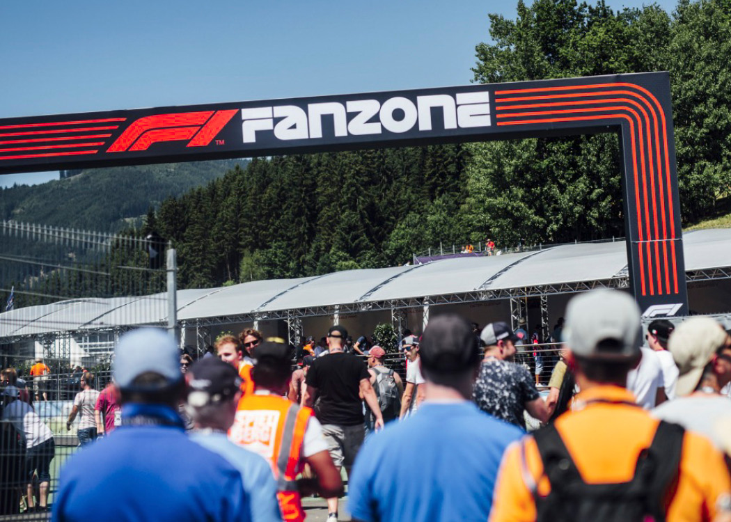
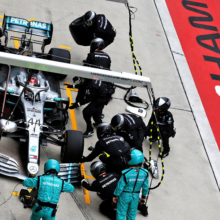
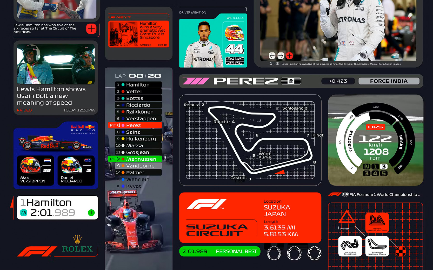
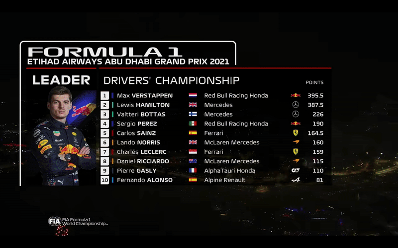
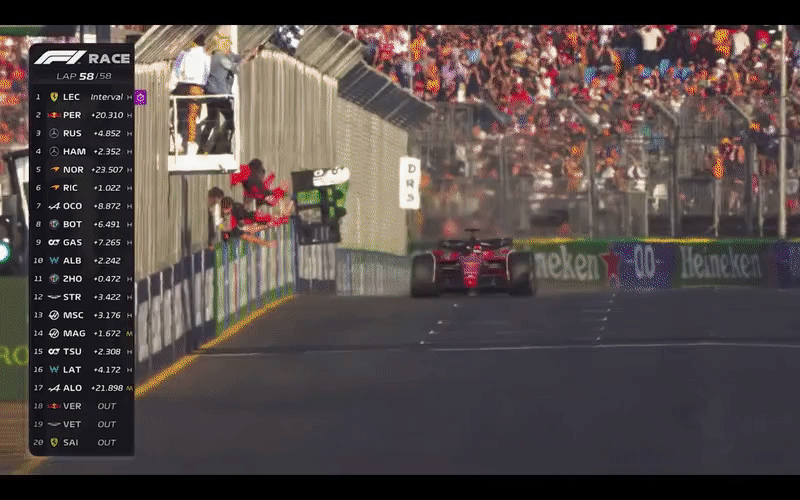
For its major rebranding late 2017, Formula 1 and agency Wieden+Kennedy needed a set of complementary typefaces in line with the video game driven new graphic identity and logotype. Closely developed together with graphic design legends Richard Turley, Luke Timothy, Sean Rees etc., the typeface family is composed of 2 display cuts (Wide + Black), plus a Regular, italic and Bold series for short texts. The collection is used across the whole identity of the events, from races lockups to pit lane signage, trophy engraving, official video game, TV broadcast or social media posts.


Typeface
Direction: Richard Turley, Luke Timothy
Design: Luke Timothy, Marc Rouault
Visual Identity
Lead Agency: Wieden+Kennedy, London
Creative Direction: Richard Turley
Project Management: Trisha Comerford
Pictures
D. Istitene, J. Moy, R. Batchelor, M. Heschl