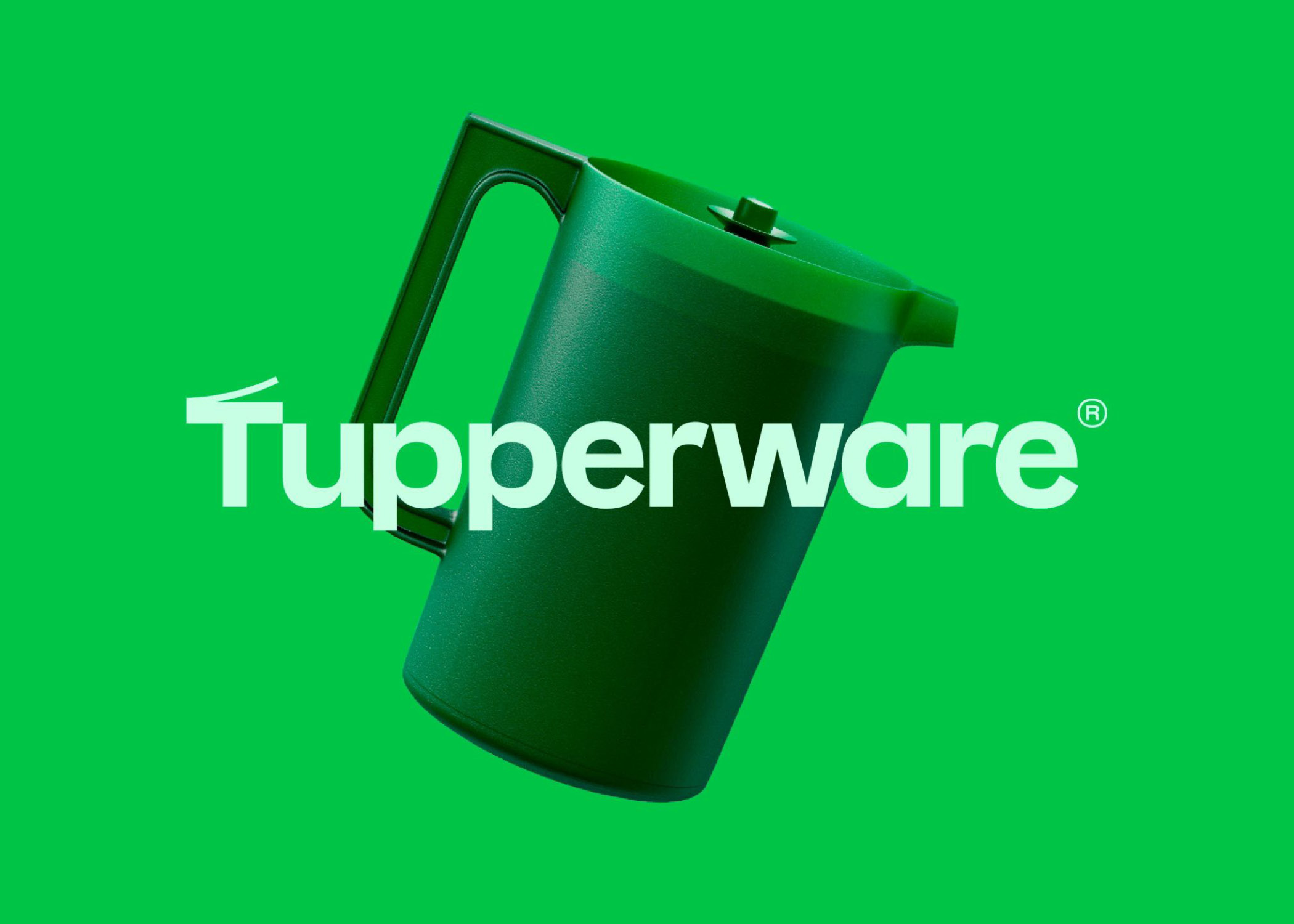
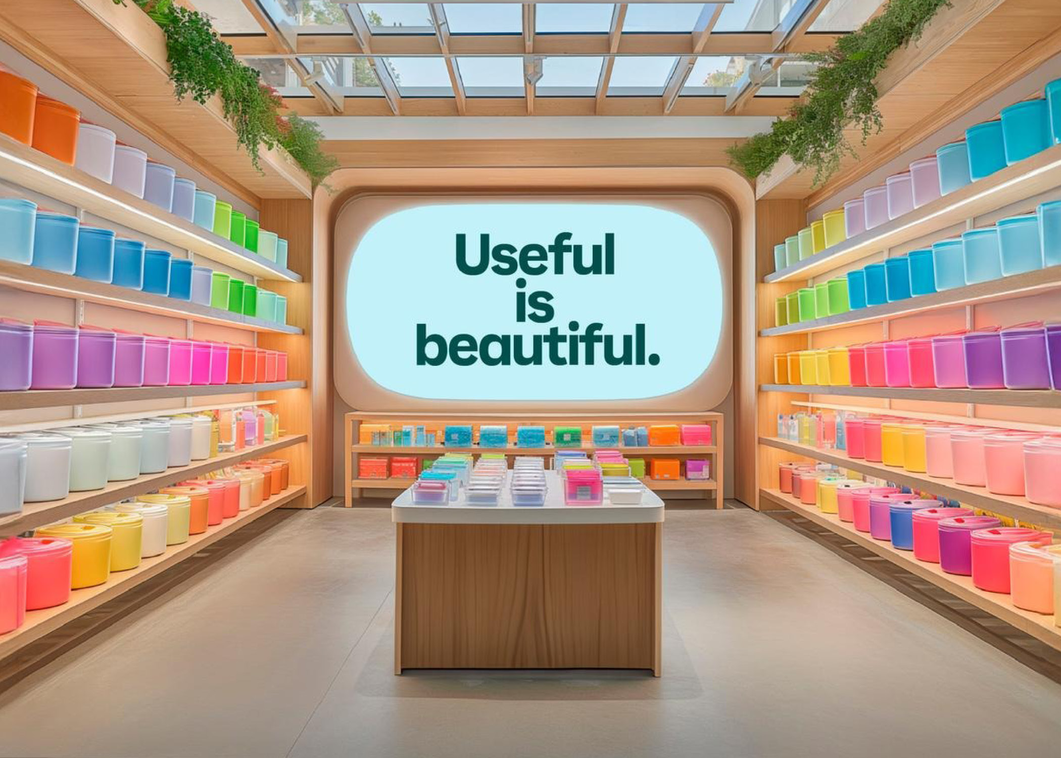
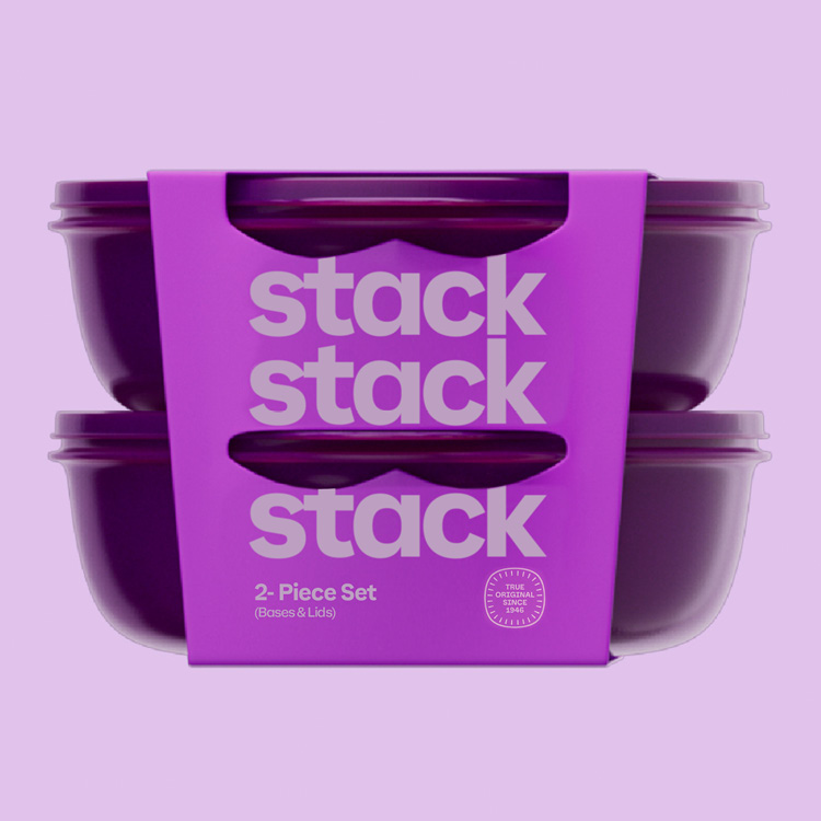
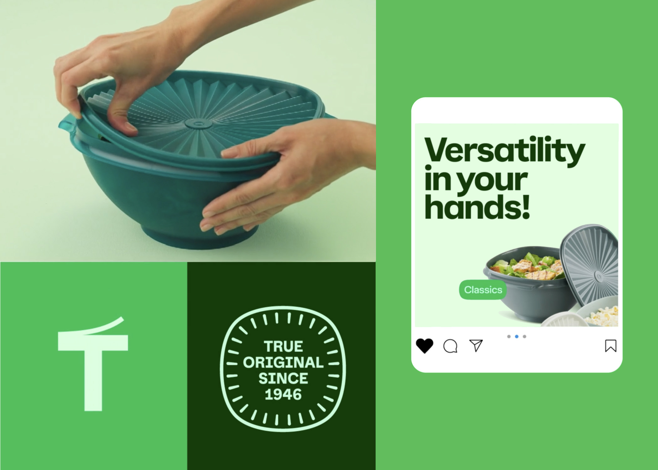

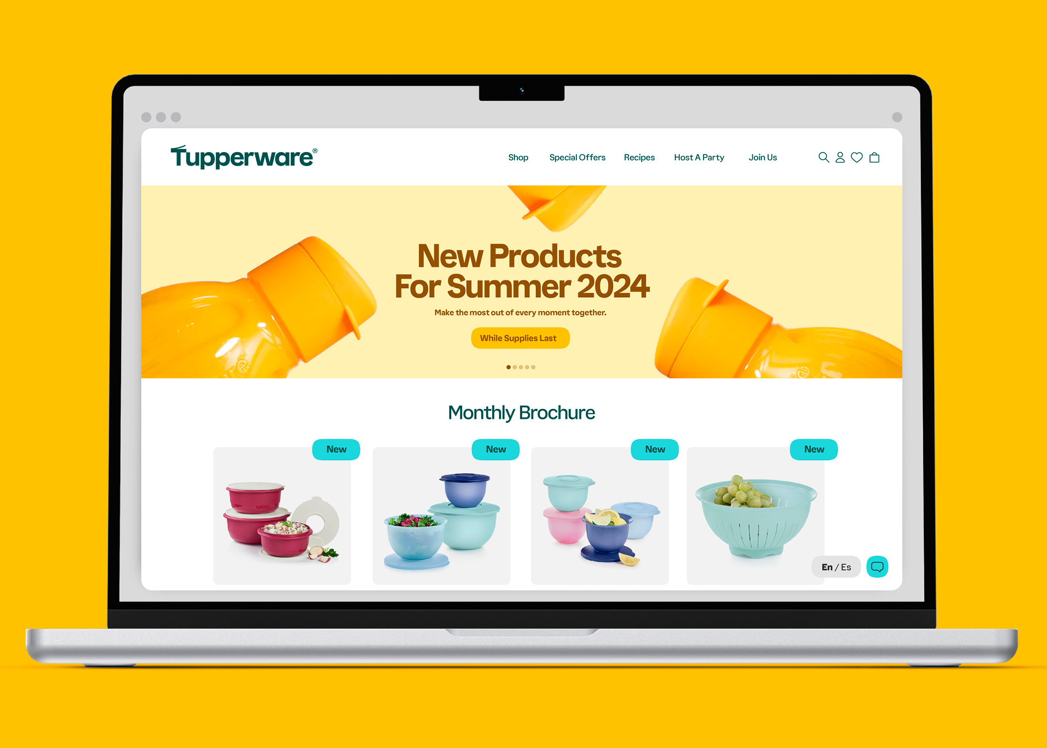
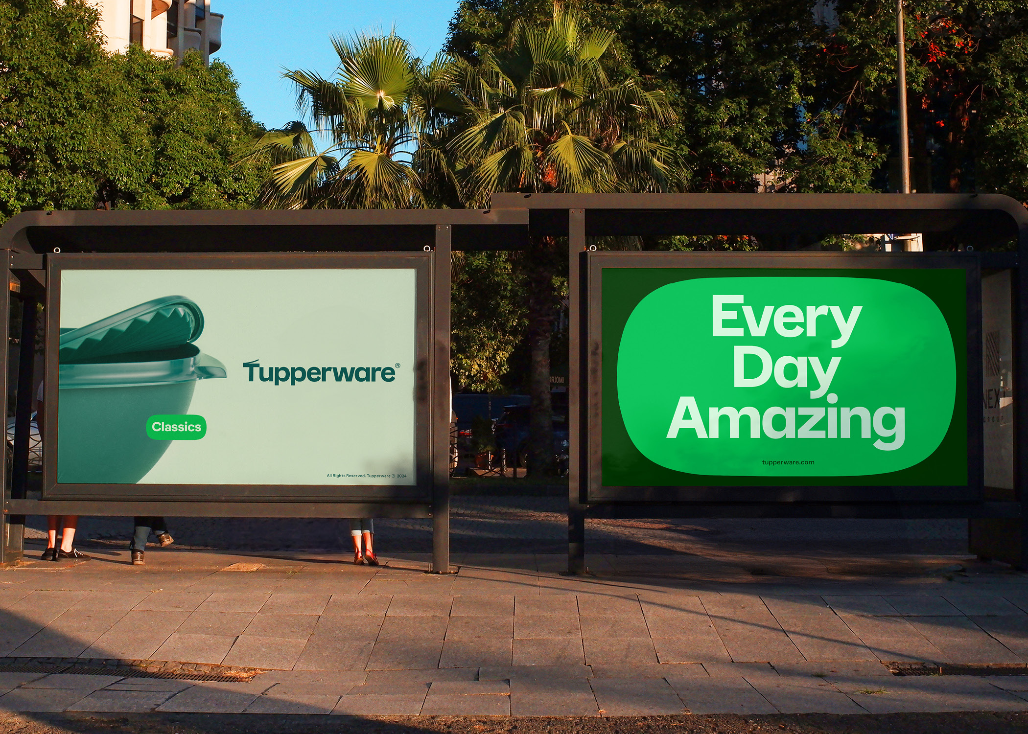
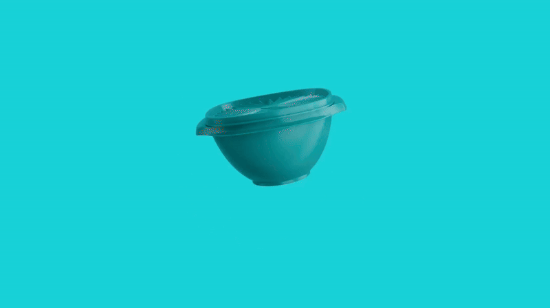
Sometimes, brands are so successful that their names become synonymous with their category. The 1946-founded kitchen goods brand Tupperware also became a genericized trademark, and the word “Tupperware”, or “Tupper”, or “Tupp” has come to refer to all reusable, sealed containers. The brand’s latest refresh, from Landor & Fitch Chicago, focuses on the containers specific shapes and function. The wordmark now features a lid topped capital T, and a bespoke typeface where the counter-shapes refer to the iconic bowl.


Typeface
Direction: Jérémie Barry
Design: Marc Rouault
Visual Identity
Lead Agency: Landor & Fitch
Creative Direction: L.Aboyte, S.Osuna
Project Management: Howard Klein